I've been thinking ahead to tank painting, and what I'll do about painting it. I decided that I would design some lettering for the tank. The original plan was to silver leaf (or palladium as Scarlett told me I would need to use) on the tank with a painted on outline...
I got a bit arty and hacked out a sketch of something for the tank with a bit of detailing - you all know how i like to challenge myself!!!
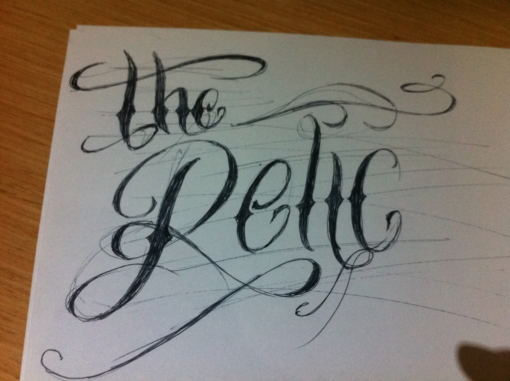
This was the basic sketch I put together. I decided that I had to attempt to learn to use illustrator to draw up the lettering in "good" for use on the tank. Scarlett was great in helping me get on my feet with the program, funnily enough in one of my emails to Scarlett i said the reason I didn't have any tattoo's is because I'm fickle and change my mind on things.
True to form half way through drawing up the design I realised I'm not Hispanic - and decided I hated the graphics I had drawn!!!
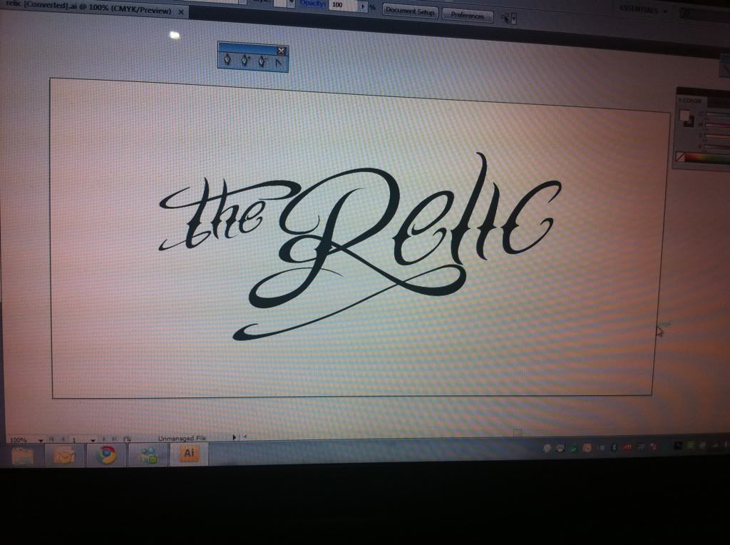
I would love to pass on some words of wisdom to help prevent this - but its a Marmite situation - you'll draw something and either love it or hate it!
Plenty more scribbling later and I had found a new design I liked enough to draw up in illustrator!
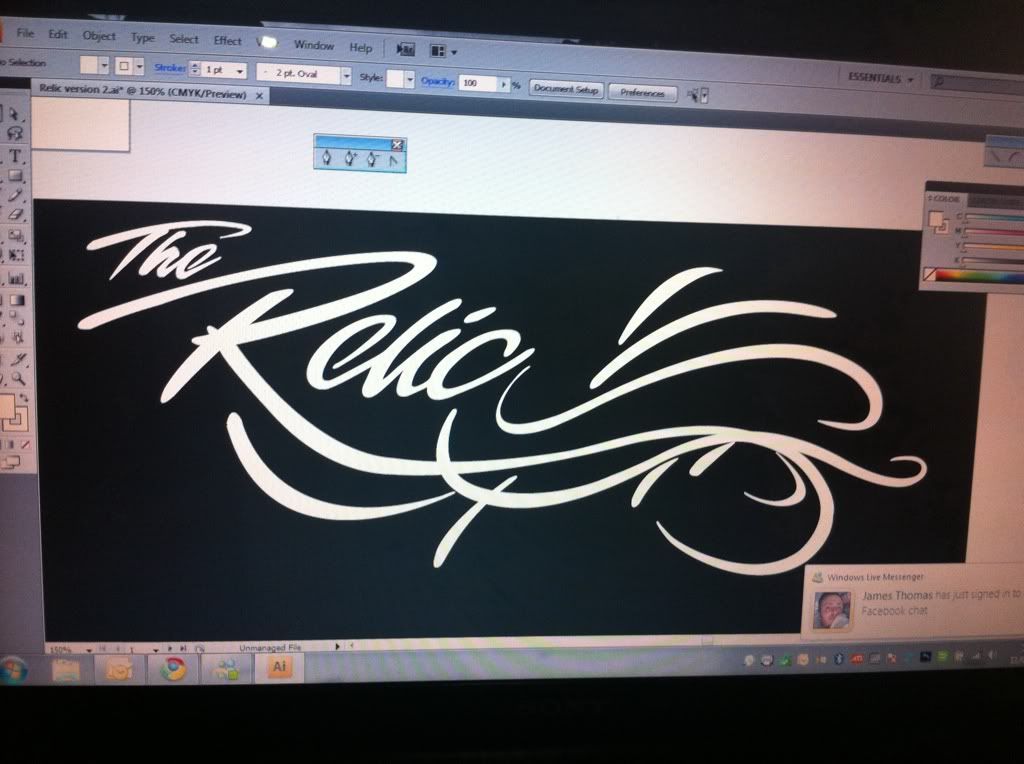
I didn't actually find it too hard to use - although I have annoyed the hell out of Scarlett the past couple of days on how to do certain things! (Sorry Scarlett!!!)
Feeling pretty happy with myself I sent it over to Scarlett to have a look at for me. a lovely response but in the nicest possible way Scarlett pointed out it would look good on one side of the tank, but look crap on the other side!!! (would look better on the left side of the tank)
with a bit more computer trickery as advised i was able to swap it around to make a pair of images that were similar, but obviously not the same!
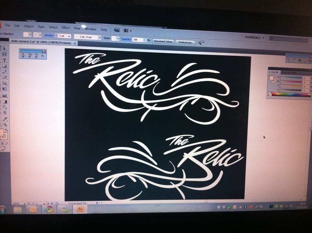
Pretty please with the outcome...
HOLD ON - not finished yet!!!
Scarlett quite rightly pointed out that although they looked right, did they actually reflect the shape of the tank?!? (couldn't open the image from you Scarlett) I did a mock-up of how the graphic would look.....
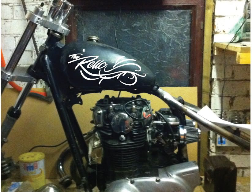
As Scarlett had quite rightly pointed out, the graphics would not work with the shape of the tank, the upper scrolls would disappear over the top of the tank, and basically look a bit crap!
I'll be sticking to the same sort of theme, but will now need to refine the design to fit the tank shape. oh and due to the fine lines the silver leaf is out the window in favour of 1shot enamel - colours yet to be decided!
No comments:
Post a Comment